Realogy Leads Engine: lead management built for how brokers actually work
Unsticking a stalled lead platform across four national real-estate brands, around speed, prioritization, and the cross-team alignment it took to ship.
The context
Realogy ran lead management for four of the biggest names in real estate: Century 21, Coldwell Banker, Sotheby's International Realty, and ERA. One platform, four brands, thousands of brokers whose deals depend on how fast they answer a lead.
The existing system worked against them. A cluttered interface, no real way to tell a hot lead from a cold one, deep navigation, weak filtering, and a mobile experience that felt like an afterthought even though brokers are rarely at a desk.
What I owned
I was brought in to get a stalled product to release. By the time I arrived, three teams had ground to a standstill: no shared definition of the product, no agreement on who owned it, and a release date that kept slipping. The design needed work. The real blocker was people: three teams with no shared plan. My job was to get UX, product, and engineering on one goal and one release.
That alignment, across three disciplines and four brands, was the core of the role. I got there with two Impact and Effort workshops that put UX, product, and engineering in one room to agree on scope and priority, direct negotiation on the points where they were stuck, and leading by example: asking the questions that surfaced the real problem, then presenting designs solid enough to settle it.
Research across four brands
Partnered with a UX researcher on interviews with 30 brokers and usability testing with 15 more, across all four brands, in brokers' real workflow rather than a lab.
One shared IA and model
Owned the information architecture and the prioritization model every brand shared, and defended it in review with each brand's stakeholders.
Directed the UI work
Directed a UI designer, setting the prioritization model and the patterns they built screens against.
Standstill to launch
Took the work from a standstill to 90%+ stakeholder agreement across the three teams and four brands by launch.
The constraints
One codebase, four brands, and a legacy system brokers already disliked. Four brands that each had to look like themselves, on one platform small enough to maintain. The user is almost never at a desk.
The decisions
The brands and teams didn't agree at the start. These are the calls I made and kept.
One system, not four. The obvious request was to let each brand shape its own flows. I designed a single prioritization model and IA that all four shared, with brand expression kept to a theming layer: color, logo, type. Per-brand custom flows would have fragmented the experience and multiplied the maintenance cost. I had to make that case to brand stakeholders who each wanted their own version.
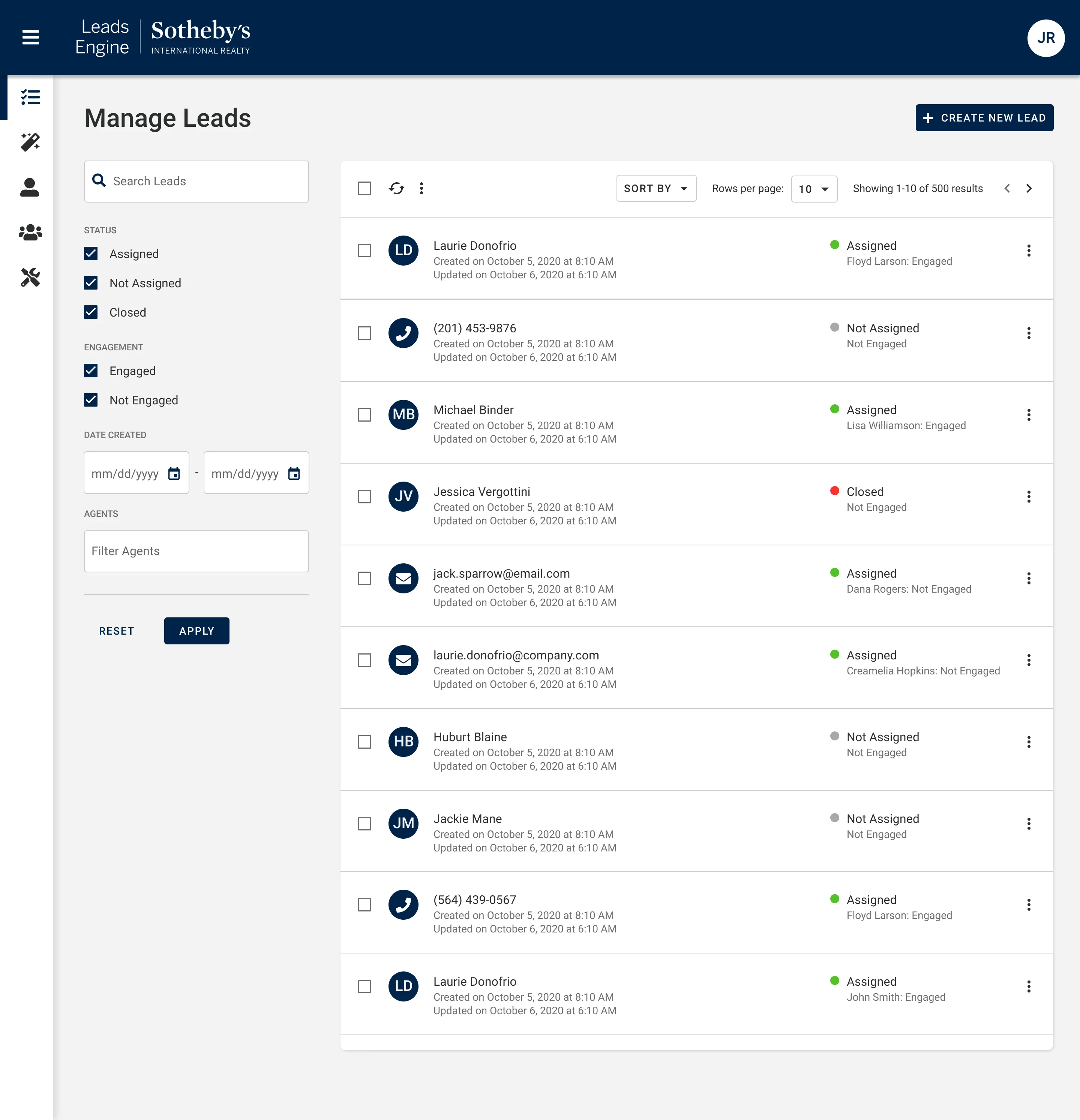
Prioritization over reporting. Research was blunt: response time drives conversion, and brokers wanted to see what was hot at a glance. I led with a triage view, hot, warm, and cold by status and label, and pushed back on the pull toward detailed reporting dashboards. Reports answer a manager's question. The broker's question is who to call next, and the design answers that first.
Mobile as the primary surface. The legacy treated mobile as an afterthought. Brokers work between showings, in cars, at open houses. I designed the prioritized view to read and work the same on a phone as on a laptop, instead of a desktop tool with a weaker phone version.
The solution
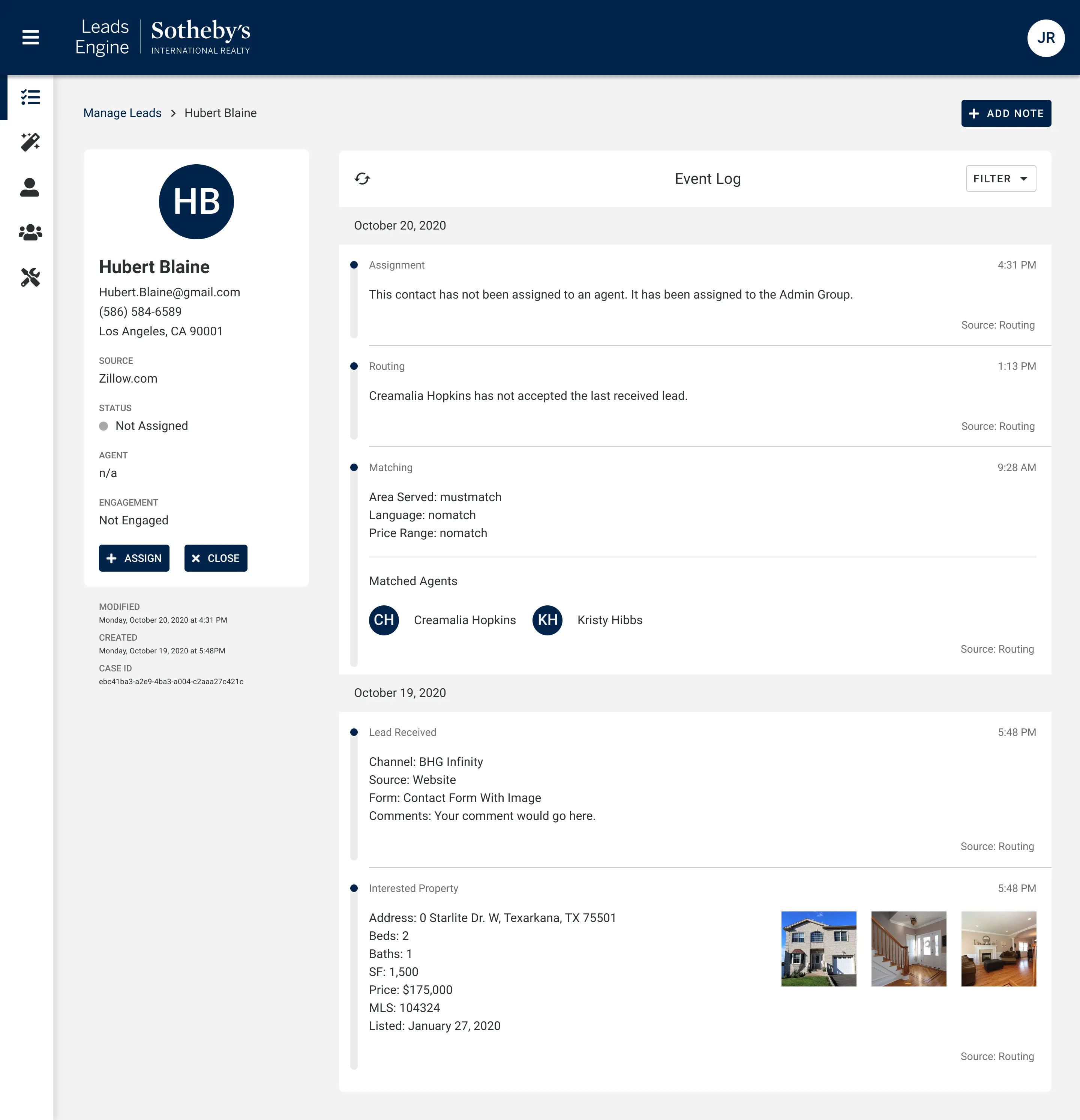
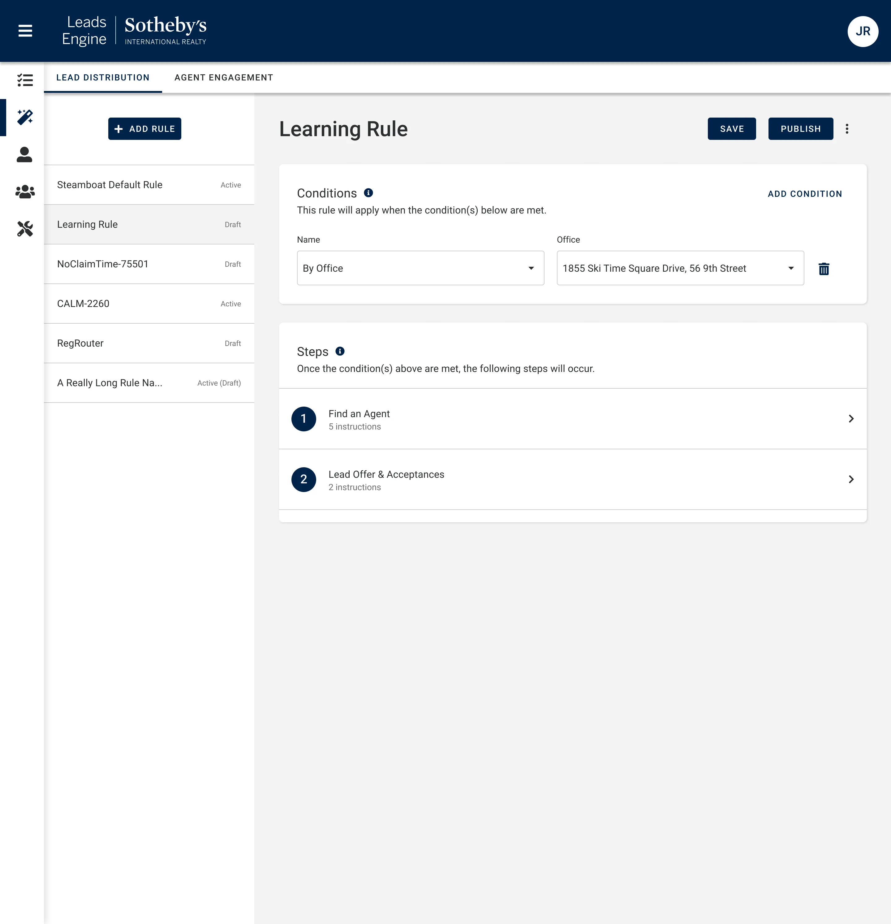
The product put priority first. Hot leads surface to the top with clear status, the most common actions, call, log, and follow up, are one tap away without leaving the list, and the same information reads consistently on a laptop or a phone. For team leads, a rule builder routes leads automatically instead of leaning on manual assignment.
The outcome
What I'd carry forward
Brokers work fast and under pressure. They already had the features. My job was to make the ones they used faster to reach. Simple won, and testing all along kept us on track.
The bigger lesson: three teams couldn't agree on what they were building. Getting them on one goal is what shipped it.