iBASEt Solumina MES: a design practice built from zero, and manufacturing taken off the desktop
Founding designer and first UX hire at iBASEt. I built the UX practice, the team, and the design system from nothing, and took a dense legacy aerospace MES mobile-first onto the shop floor.
The context
Solumina runs manufacturing for aerospace and defense, nuclear, and medical devices. Programs running on it include work for NASA, Rolls-Royce, Cirrus, Lockheed Martin, and Northrop Grumman. It worked. It also looked like a 1990s Windows client: 50 or more elements per screen, menus nested deep, thin hierarchy, and a learning curve that needed extensive training. It was also desktop-bound, one step removed from the floor where the build actually happens.
I joined as the company's first designer. There was no design practice, no team, and no system.
What I owned
All of UX was mine, from day one.
- I built and led the UX team. I hired a designer straight out of college, on site, and mentored them up to Senior UX Designer, and brought on a second designer in India.
- When I arrived, the product team had no working practice around user stories, and the effort had stalled at the login screen with no agreed path past it. I found a product manager inside the company, partnered with them and mentored them on writing user stories, and together we defined the problems that were actually worth solving.
- I partnered with sales to reach real users: getting onto the shop floors of companies running Solumina, and of companies still doing everything on paper, and spending the annual Solumina user events talking with technicians one on one about where their workflow slowed down and how to speed it up.
- Engineering resisted from the start, pushing back on even implementing the designs. Getting them on board was part of the role, and I worked with them directly until they saw it working.
- I built the design system itself: Axure prototypes to pressure-test ideas before any production code, then a tokenized React and Material UI system with a swappable brand layer, so each customer could be given their own theme.
The decisions
Density to clarity. The first job was subtraction. Dense data tables became scannable, prioritized cards; a persistent global navigation and contextual side panels replaced nested dropdowns; work screens were rebuilt around clear typography and collapsible sections. Screens that once held 50 or more elements now carry 15 to 20.
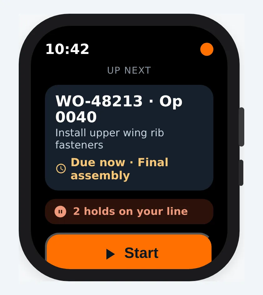
Off the desktop, onto the floor. The bigger bet was that the product belonged where the work is. I designed everything mobile-first and scaled it up to tablet and desktop, rather than shrinking a desktop tool down. The base layout assumes a phone in one hand: thumb-reachable navigation, a prominent scan action, full-width cards, 44px targets. The wearable was the smallest screen. If the next step and a one-tap start worked there, the idea held up.
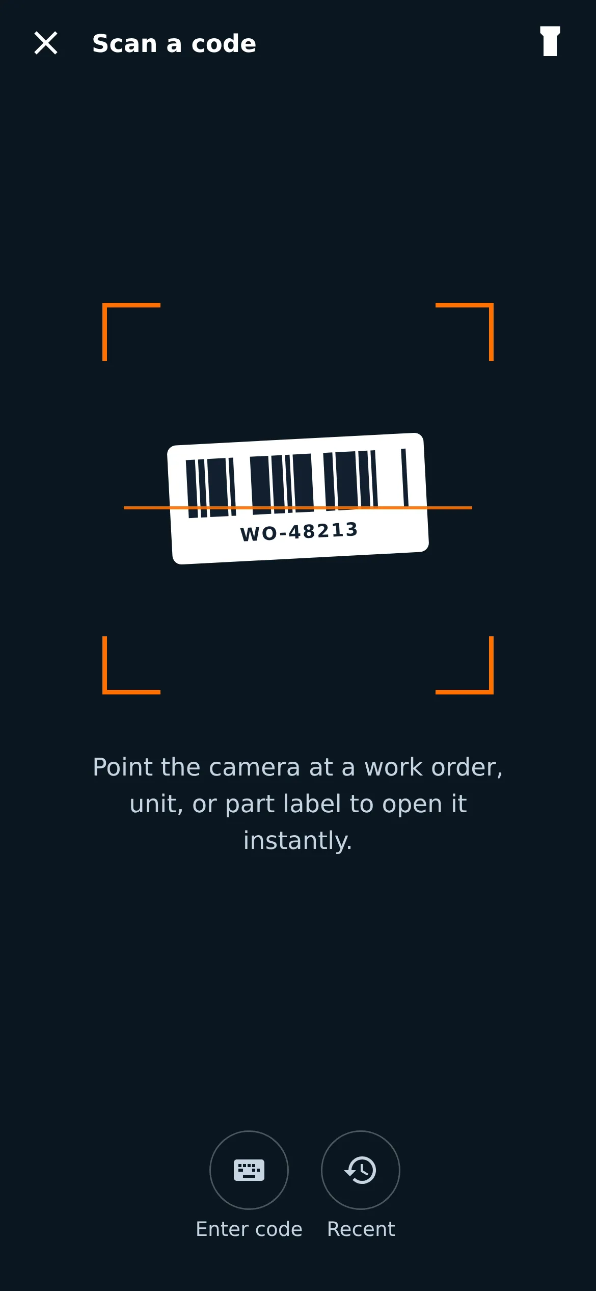
Scan-first for gloved hands. A technician mid-build has hands busy or gloved, works in variable light, and needs an answer in seconds. Before this, they were tied to fixed terminals, walking back and forth across the floor to look up a part or log a defect, relying on memory or scribbled notes in between. So I built the floor experience around one fast loop: scan a part, see its details and history, take the next action (log a discrepancy with a photo, or move on), with a keyboard-operable manual-entry fallback so the flow never depends on the camera. A dark, high-contrast interface suits the floor and large controls survive gloves. This scan-first workflow is where the clearest win came.
What shipped
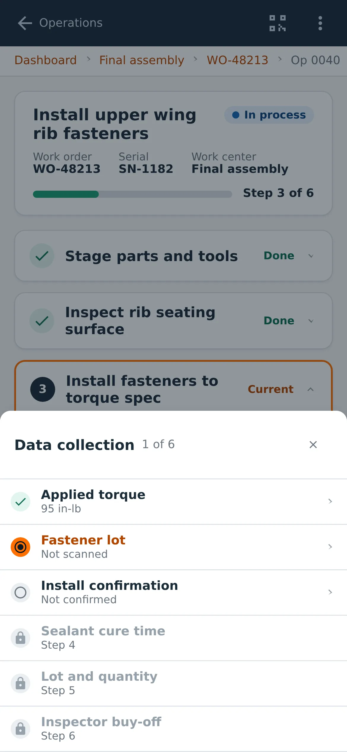
The result reads consistently from a workstation down to a phone and a wearable: a glanceable dashboard across active programs, a guided step-by-step work instruction, an as-built traceability tree, and the scan entry point that ties it together.
The screens here are wireframe recreations I rebuilt from memory for this portfolio, because the production system runs inside customer environments. The structure, interactions, and design language are what I shipped; the data is fictional.
Accessibility
Held to WCAG AA throughout. Status never relies on color alone; every state pairs a colored indicator with a text label, and text meets contrast minimums. Controls are keyboard reachable with visible focus, the as-built component tree uses a full ARIA treeview with arrow-key navigation, dialogs manage focus, and errors announce through live regions. Camera scanning is paired with a keyboard-operable manual-entry path, so the work is completable without the camera.
The outcome
"Mike built a small UI/UX team and led it successfully from initiation through release. He puts a lot of thought into design decisions, listens carefully to feedback, and collaborates well with developers and PMs."Bob Joyce · VP of Product Development, iBASEt
What I'd carry forward
Most of the work was taking things away. The power was already there. I cleared the clutter and put it on the floor. The other half was people: building a practice from nothing and winning over an engineering team that pushed back.